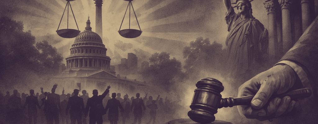
This scene is playing out in offices and boardrooms all over the country: a long table, a cautious room, a proposal everyone agrees is important but no one is ready to approve.
The meeting has all the familiar signs of trouble. People are polite but unconvinced. The project sounds reasonable, yet somehow risky. Someone worries about cost. Someone else worries about public reaction. A few heads nod, but no one looks ready to commit.
On paper, the idea works. In conversation, it feels abstract. Everyone is reacting to a slightly different version of the same problem.
Then a map goes up on the screen.
Not a Fancy Map, Just the Right One
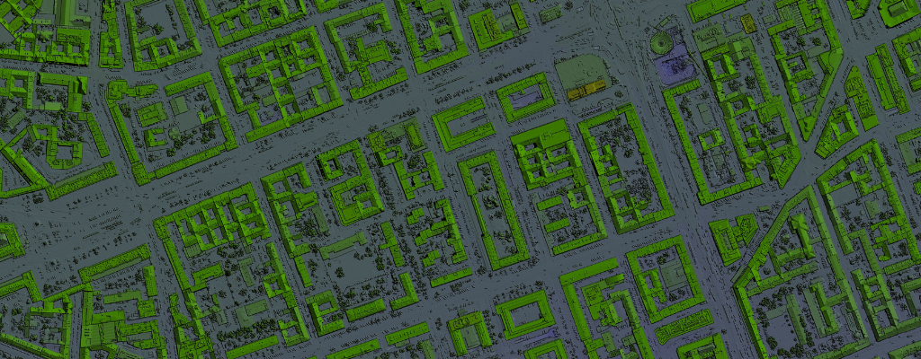
There are no animations, no dashboards, no visual fireworks. Just a clear map that shows where the problem actually shows up, how often it happens, and who deals with the consequences when it does. Parcels, service areas, historical incidents, and constraints all live in the same frame.
The tone in the room changes. Questions stop being philosophical and start being specific. The conversation moves from “Do we need this?” to “How do we do this without making things worse?”
By the end of the meeting, the answer is yes.
Why Seeing the Problem Changes the Conversation
Most resistance in public-sector decisions does not come from stubbornness. It comes from uncertainty. Decision-makers are asked to approve projects that affect budgets, neighborhoods, and reputations, often with limited context and even less time.
A written description leaves too much room for interpretation. A spreadsheet assumes trust that may not exist yet. A map closes that gap. It lets everyone react to the same information at the same moment.
Once people can see a problem spatially, debate shifts. Instead of questioning whether the issue is real, attention moves to where it is worst, who is impacted, and what happens if nothing changes.
When Funding Reviews Turn Into Problem Solving
Take a stormwater funding review as an example. Without GIS, the discussion usually revolves around totals. Miles of pipe. Dollar amounts. Timelines that feel long and expensive.
With GIS, the story changes. Reviewers can see repeated flooding locations, downstream effects, critical facilities at risk, and how proposed improvements connect instead of scatter resources. The focus moves away from cost alone and toward consequences and tradeoffs.
That shift matters. People approve projects more easily when they understand what inaction looks like.
Public Meetings Go Better When Everyone Shares the Same Picture
Public hearings follow a similar pattern. Residents often arrive worried about disruption or skeptical of broad explanations. A clear map showing boundaries, buffers, and alternatives reduces confusion fast.
People still push back. They still ask hard questions. The difference is that those questions are grounded in shared understanding instead of assumptions. The discussion becomes more constructive because everyone is reacting to the same visual reality.
Simple Maps Win More Often Than Clever Ones
The maps that change outcomes are rarely the most complex. In fact, complexity tends to backfire in these moments. The most effective maps are designed for the room, not the analyst.
They focus on the question being asked, not every question that could be asked. They remove layers instead of adding them. They explain rather than impress.
This is where GIS teams often miss the opportunity. Maps get brought in late, after opinions have hardened, or treated as supporting material instead of the backbone of the conversation. When GIS frames the discussion early, it has far more influence.
What a “Yes” Really Means
GIS does not make decisions for people. It makes decisions easier to defend. Confidence comes from understanding tradeoffs, seeing impacts clearly, and recognizing patterns that would otherwise stay hidden.
In organizations where GIS is trusted, maps become the common language. Meetings run shorter. Arguments feel less personal. Decisions still require judgment, but that judgment rests on something everyone can see.
The most effective GIS teams are not chasing approval with flash or novelty. They are building clarity, one map at a time, and watching how often clarity turns hesitation into agreement.
Turning Clarity Into Confidence
The difference between hesitation and approval is often clarity. InteractiveGIS works with public-sector teams to build maps that frame discussions early, answer the questions decision-makers actually ask, and support confident choices before meetings, hearings, and funding reviews.
If you have an upcoming decision where the room feels divided, that’s the moment GIS should be leading the conversation, not reacting to it. We help teams prepare those maps before the meeting, so the discussion starts with shared understanding instead of uncertainty.
Explore how InteractiveGIS can support your next critical conversation.
From Infrastructure to Insight: GIS Conversations That Defined 2025