Everyday Mapping: How Digital GIS Tools Quietly Make Our Communities Safer and Smarter
When most people think about maps, they picture something simple — a road atlas, Google Maps on their phone, or maybe a hiking trail map. But behind the scenes, digital mapping does far more than help us get from point A to point B. Geographic Information Systems (GIS) have become the quiet infrastructure supporting daily life, especially in rural communities where resources are often stretched thin.
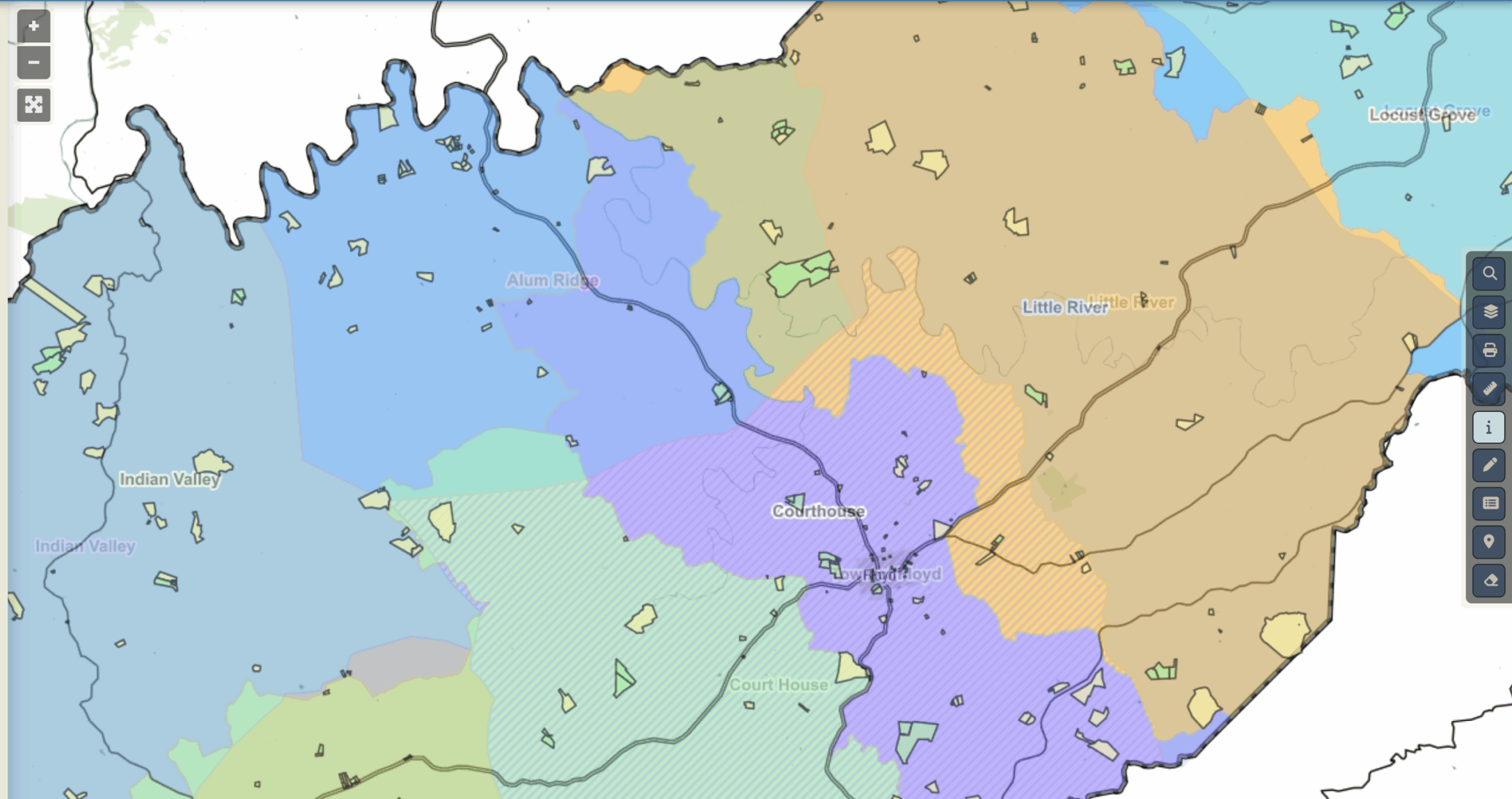
With tools like iGIS™, counties, schools, and local organizations can see their data in living color — literally — making decisions faster, fairer, and more efficient. Here are some ways mapping quietly makes a difference that many people never stop to think about.
Keeping Schools Safe

School safety is always top of mind for families and administrators, and mapping has become a surprising ally. By layering school building layouts, bus routes, and emergency access points, leaders can plan more effective safety protocols. Local law enforcement can quickly visualize entry points, while transportation managers optimize bus stop locations so students aren’t waiting on busy highways or walking unsafe distances.
Modern GIS dashboards go even further — integrating digital floor plan PDFs or even 3D walkthroughs so first responders can virtually “enter” the building before they arrive on-site. In the event of an emergency, from medical calls to active shooter situations, that level of awareness helps responders move quickly and make smarter decisions in moments when every second counts.
Smarter Routes, Less Waste

Think about services like snow plowing, trash pickup, or utility meter reading. The cost of fuel and staff time adds up quickly, and in rural counties, covering long stretches of road can be overwhelming. GIS dashboards help managers calculate route density — how many stops fit efficiently into a single route — so trucks spend less time backtracking and more time serving residents.
These tools also make it possible to aggregate problem issues. Instead of responding to one call here and another call miles away, managers can see clusters of service needs on a map and address them in a single trip. That means fewer hours wasted on unnecessary travel, less wear on vehicles, and reduced fuel costs — all while residents get faster solutions.
Communication in Real Time

Digital mapping also strengthens how governments and organizations talk to their communities. A great example is broadband expansion. Instead of residents filling out forms and hoping for progress, maps can clearly show where service is strong, where gaps exist, and where grant dollars are being invested.
The same holds true for utilities. When an outage happens, a simple visual dashboard lets everyone see what’s impacted and when service is expected to be restored. That kind of clarity reduces frustration and builds trust — two things every county or service provider values.
Making Redistricting Understandable
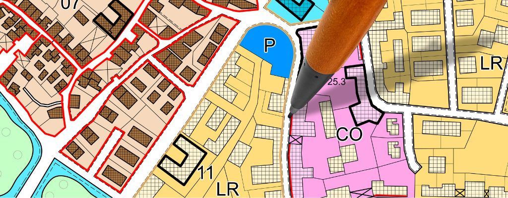
For many people, redistricting feels like a maze of confusing legal descriptions. A line moved here, a boundary redrawn there, and suddenly your voting district changes. Digital mapping makes this process transparent. Instead of reading long documents, residents can view an interactive map and see how boundaries shift in real time. It’s easier to understand, easier to question, and easier to ensure fairness when everyone can see the same information.
These tools also improve communication between counties and state managers. By layering in population data — along with demographics, zoning information, and other relevant data points — decision-makers can see the full picture before finalizing changes. That means more effective planning, less
Campaigns That Connect

Public health and outreach campaigns are stronger when they’re visual. Take flu season, for example. Health departments can map outbreak clusters, then tailor messaging or vaccination clinics to neighborhoods where they’re needed most.
The same principle works in agriculture. Extension services can map soil types, farms, and land use to better share resources with local growers. A single dashboard can reveal where drought-resistant seed would have the greatest impact or where soil conservation programs are most critical.
Why It Matters in Rural Communities

Rural counties don’t always have the luxury of large budgets or staff. That’s why efficiency matters so much. Digital mapping reduces duplication, speeds up decisions, and brings transparency to complex issues. It’s not just about making a nice visual — it’s about stretching every tax dollar further, keeping people safer, and ensuring that no one is left out because of geography.
Studies offer concrete proof of the benefits:
- In rural EMS operations, GPS navigation cut response times significantly—reducing average arrivals from 13.7 minutes to 9.9 minutes, a 28% improvement in matched instances.
EsriPubMed - In Illinois, detailed indoor school mapping helped emergency responders move faster—creating shared situational awareness that shaved seconds off response times during critical incidents.
- A data-driven redesign of police patrol zones in Atlanta reduced response times to high‑priority 911 calls by 5.8%.
Over years of use, such gains accumulate into real savings. For smaller communities, the payoff shows up in simpler but equally meaningful ways — fewer wasted trips, less fuel and vehicle wear, and staff time freed up for higher-value tasks.
A tailored dashboard makes those gains even stronger. Rather than forcing teams to adapt to generic software, a custom GIS platform matches the way a county or school district actually operates. That means smoother workflows, better communication between agencies, and a tool that saves money and manpower year after year.
The Quiet Infrastructure That Works for You
The truth is, we already rely on digital mapping more than most people realize. When your trash gets picked up on time, when your power company updates you about an outage, when your child’s school runs a bus safely down a rural road — it’s all powered by GIS.
At iGIS™, we believe these tools should fit the unique needs of each community. No two government entities or organizations operate the same way, which is why a customized dashboard beats an out-of-the-box system every time. With a tailored approach, local leaders can focus on solving problems instead of working around software limitations.
The next time you enjoy a service that runs smoothly or appreciate quick updates during a local emergency, remember: a map probably had something to do with it. Digital mapping may not make headlines, but it quietly powers safer, smarter communities every day.
If you’re curious how mapping could work for your organization, we’d love to show you what iGIS can do.


Why Choose InteractiveGIS Over an Off-the-Shelf Mapping Tool?