


Summer has a way of turning your county’s parks department into the most popular office in town. Residents want to know where the splash pad is, whether the boat ramp at the lake allows trailers, and if that trail on the east side of the county connects to the new greenway. Visitors are asking the same questions, usually from a parking lot with spotty cell service, hoping someone thought to put the answer online. A well-built public recreation map answers all of it before anyone has to ask.
This isn’t a niche technical project reserved for large metro areas with deep GIS budgets. Counties of all sizes are building public-facing recreation maps that surface everything from kayak launches to pickleball courts, and the technology has become accessible enough that the harder challenge is deciding what to include — not how to build it.
What Belongs on a Summer Recreation Map
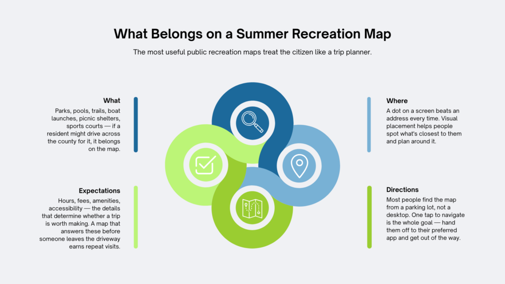
The most useful public recreation maps treat the citizen like a trip planner. They want to know what’s there, where it is, how to get to it, and what to expect when they arrive. A map that answers those four questions covers most of the ground.
For summer specifically, the high-demand assets are predictable: parks with shaded picnic areas, splash pads and spray parks (with operating hours), public pools, boat ramps with trailer parking notes, fishing piers, trail systems with surface type and length, and recreational facilities like community centers or sports complexes. The mistake many counties make is publishing a static PDF map that freezes the information in place. An interactive GIS-powered map lets staff update hours, flag seasonal closures, and add new assets without starting over from scratch.
Layering is what makes a recreation map genuinely useful rather than just visually interesting. A single map can hold a trail layer, a water access layer, a facilities layer, and a restroom and parking layer — all toggled on or off by the user. Someone planning a fishing trip pulls up boat ramps and parking; a parent looking for something to do with kids on a hot afternoon toggles splash pads and playgrounds. The same map, shaped around different needs.
Counties and Cities Getting This Right
A few examples worth noting, because proof of concept matters.
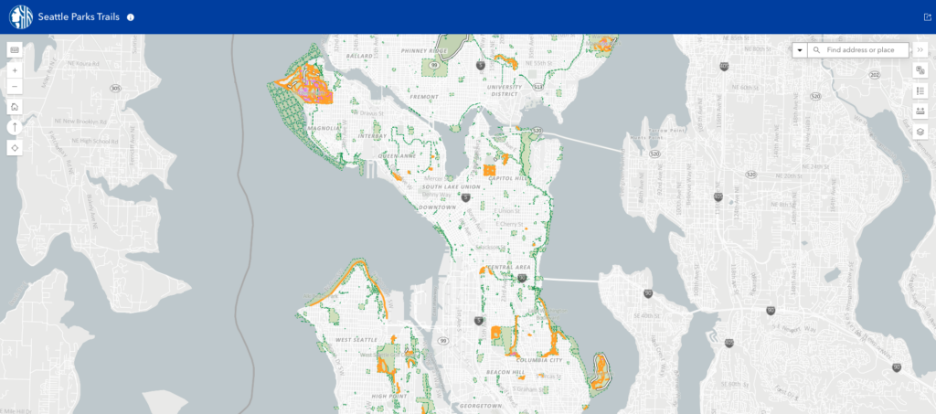
Seattle Parks and Recreation, in partnership with Seattle IT, launched an interactive trail mapping system in 2025 covering more than 485 parks and greenspaces across the city. The platform delivers trail classifications, width and length, surface material, canopy coverage, grade percentages, and nearby amenities — all accessible from a mobile device. Physical QR codes installed at trailheads and park kiosks connect users to the live map instantly. That last detail is worth borrowing: a QR code on a sign at the trailhead means the map reaches people at the exact moment they need it, not just the ones who planned ahead. See it in action here.
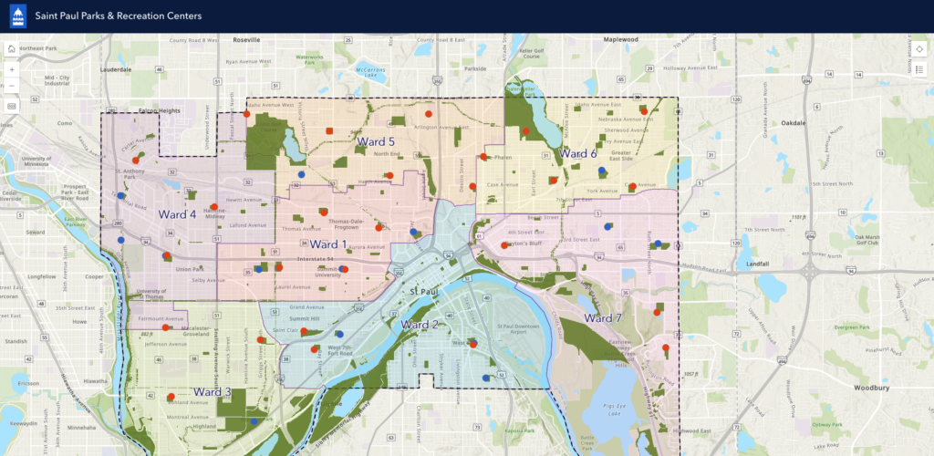
Saint Paul, Minnesota publishes category-specific interactive maps organized by amenity type, including aquatics, splash pads, bikeways, trails, dog parks, fitness rooms, pickleball courts, recreation centers, shelters, and skate parks. Breaking them out by category rather than forcing users to filter a single crowded layer makes the experience faster and more intuitive.
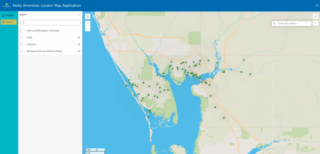
Charlotte County, Florida offers a Park and Recreation Finder that helps residents and visitors locate parks and recreation activities throughout the county, pulling together beaches, splash pads, fishing piers, and boat ramps in one searchable interface. It’s a model that works because it starts from the user’s question — “where can I go?” — rather than the department’s organizational chart.
What Makes a Public Recreation Map Actually Work
Building the map is only part of the equation. The data behind it has to be maintained. A boat ramp flagged as open when it’s actually closed for repairs doesn’t just frustrate users — it erodes trust in the map and, by extension, in the county that published it. Keeping recreation layers current is a reasonable ask when staff can update them from a browser or mobile device rather than submitting a help ticket and waiting.
Accessibility matters too. A map that isn’t readable on a phone in direct sunlight, or that requires a download, or that doesn’t display well on older devices, fails the users who most need it — visitors unfamiliar with the area, seniors exploring recreation options for grandchildren, tourists without local knowledge. Good public-facing GIS is designed for the person standing in a parking lot, not just the person at a desktop.
Finally, the map should be findable. It belongs on the parks department homepage, linked from the county’s tourism or visitor pages, and indexed for search. A beautifully built interactive map that lives three clicks deep behind a government portal doesn’t serve anyone who doesn’t already know it exists.
Putting It Together with iGIS®
iGIS® gives counties a web-based platform for building exactly this kind of public-facing experience. Recreation layers can be built from existing asset data, styled for public audiences, and published without requiring the public to log in or download anything. Staff can update information directly, add seasonal layers for summer programming, and share the map via a simple link that works on any device.
If your county’s recreation assets exist in spreadsheets, old paper maps, or an internal GIS that the public can’t access, this summer is a reasonable time to change that. The questions citizens are already asking have answers. A well-built public map just makes sure those answers are easy to find.
Curious what a summer recreation map could look like for your county? Reach out to the team at InteractiveGIS — we’re glad to walk through it. Learn more about our 90-day free trial here.