
As the Halloween season rolls in, most people are thinking about haunted houses, ghost stories, and things that go bump in the night. But for anyone who works with spatial data, the true fright often hides in something far more mundane — outdated datasets, misplaced coordinates, and shapefiles that refuse to die.
The truth is, even the best maps can turn problematic when data isn’t current or communication breaks down. From lost drivers in the desert to international border disputes, real-world mapping mishaps show how a few errors in a dataset can create real consequences. Consider these true tales from the unnerving side of cartography and what they reveal about keeping GIS systems accurate, connected, and reliable.
The Desert Illusion: When Apple Maps Led Drivers Astray

In 2012, Australian police issued an unusual warning: Don’t rely on your phone to get to Mildura.
Apple Maps, in its early days, mistakenly plotted the city of Mildura about 40 miles from its actual location — deep inside a remote stretch of Murray-Sunset National Park. Drivers following those digital directions found themselves stranded in scorching desert conditions, miles from water or cell service. Some were stuck for hours before rescue teams arrived.
It was a stark reminder that precision in GIS isn’t optional. A single coordinate error, multiplied across millions of devices, becomes more than an inconvenience; it can be dangerous.
Lesson learned: Accuracy and field verification matter. A seemingly tiny spatial error can scale into a serious safety issue once it’s deployed to public platforms.
Source: BBC News, “Apple Maps ‘is life-threatening’ to motorists lost in Australia heat”
The Border Blunder: When a Map Sparked a Diplomatic Dispute
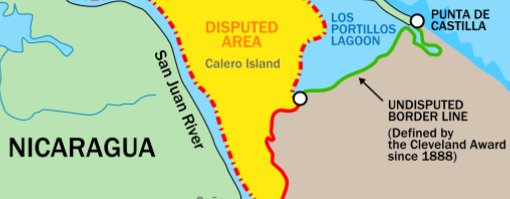
In 2010, a small but serious cartographic error appeared on Google Maps. A section of the San Juan River that marks the border between Costa Rica and Nicaragua was displayed incorrectly, showing Nicaraguan territory extending several hundred meters into Costa Rica.
Relying on that map, a Nicaraguan military unit briefly crossed the border and planted a flag. The result was a diplomatic dispute that required intervention from the Organization of American States.
While the incident was eventually resolved, it highlighted how mapping errors can have geopolitical consequences. What starts as a misaligned dataset can quickly turn into an international misunderstanding.
Lesson learned: Maps shape perception, and perception drives action. Even small digital errors can influence real-world decisions.
Source: CNN, “Google Maps border becomes part of international dispute”
The Phantom Flood Zones: When Old Data Haunts Communities
Floodplain maps might not sound alarming until you realize many are decades out of date. Across the U.S., FEMA flood maps often rely on data that predates major development and evolving weather patterns. In some areas, maps haven’t been updated in over 15 years. The result? Homes that appear safely outside high-risk flood zones are, in reality, vulnerable.
In 2021, ProPublica reported that millions of Americans live with a false sense of security because their flood maps don’t reflect current conditions. When those inaccuracies meet a major storm, the result can be devastating — insurance gaps, property loss, and delayed response.
Lesson learned: Old data doesn’t just clutter your GIS; it misleads the people who rely on it. Regular updates and local validation protect both property and trust.
Sources:
NFP, “How FEMA’s Outdated Flood Maps Leave Millions at Risk”
Bipartisan Policy Center, “Let’s Start with Better Floodplain Maps”
The Wrong Coordinates: When Help Goes to the Wrong Place

In emergency response, even a few digits off can mean the difference between minutes and miles.Before GIS became fully integrated with modern dispatch systems, mis-entered coordinates and incomplete address data often led responders astray. Calls made from mobile phones, in particular, were difficult to pinpoint because legacy 911 systems weren’t built to process precise GPS or coordinate data.
Today, next-generation 911 (NG9-1-1) systems are changing that. Modern GIS integration allows dispatchers to receive accurate, real-time caller locations directly from mobile devices and mapping tools. According to Comtech’s Solacom Geo-Location White Paper, these advancements are dramatically improving the precision of emergency response by linking enhanced location data with GIS-based call handling.
The shift is not just technological — it’s lifesaving. When location data flows seamlessly between callers, networks, and dispatch centers, responders reach people faster and with greater confidence.
Lesson learned: GIS has become a cornerstone of emergency infrastructure. Clean, current, and interoperable data ensures that every second counts when it matters most.
Source: Comtech, Solacom Geo-Location White Paper (PDF)
The Real Monster: Bad Data

All of these stories share a common culprit — poor data management. It lingers in outdated spreadsheets, unverified files, and forgotten network drives. It creeps into systems when updates aren’t shared or metadata isn’t documented. Left unchecked, it grows quietly until the damage is visible. Fortunately, every horror story has a fix. In this case, it’s sound data practices and a culture of accuracy.
Five practical ways to keep your GIS healthy:
- Document sources clearly. Metadata matters. Record who created the data, when it was last verified, and its intended use.
- Use version control. Keep historical copies but identify one authoritative layer to avoid confusion.
- Centralize updates. Encourage departments to work from shared datasets instead of separate versions.
- Audit regularly. Set a review schedule to remove outdated or redundant files.
- Educate your users. Good data habits prevent accidental overwrites and ensure everyone trusts the results.
Exorcising the Errors

GIS itself isn’t frightening. The problems arise when information is incomplete, siloed, or outdated. Modern web-based systems like iGIS® help organizations avoid those pitfalls by synchronizing data across departments, maintaining clear permissions, and ensuring updates are immediately reflected. That kind of transparency eliminates the confusion and delays that make good data go bad.
Whether managing infrastructure, parcels, or public safety assets, consistent data stewardship turns uncertainty into confidence. It’s what separates a well-run GIS from one full of surprises.
Take time this fall to review your layers, clean up archives, and ensure your GIS remains something everyone can trust. And if your system feels a little haunted by old data, we’re here to help restore order before the next mapping mishap makes the headlines.
No tricks, just treats: enjoy a 90-day free trial of iGIS® and and make sure your maps never haunt you again.👻


Parks & Recreation: Efficient Land Management Using GIS